Stock picking is complex, and understanding stock charts is the essential first step. We present our beginner’s guide on how to read a stock chart.
We present a method for picking individual stocks. In case you are new to investing, we advise that you start out by investing in index funds or mutual funds. This will permit your portfolio diversification, paring down risk even as you learn more about the stock market.
In case you do decide to invest in individual stocks, the article concentrates on assessing individual companies.
If you are a seasoned investor and wish to learn a key tool for choosing individual stocks, we have more for you.
Getting started with investing can be challenging or absolutely horrifying for some. There are LOADS of information to digest. Where do you start?
The most appropriate starting point is reading and making sense of stock charts. Indeed, it does not sound that much of a thrill. However, you have the advantage when you really wish to assess the stock you plan to buy with this skill.
The article will break down the basics of a stock chart and point out the vital things you have to concentrate on. By the end, terms like ‘dividend’, ‘trend line’, and ‘lines of support’ will not appear at all alien.
Precisely what is a stock chart, and how does it help you analyse stocks?
To put it plainly, a stock chart is a graph that lays out for you a stock’s price over a given period of time. For instance, five years. Of course, more advanced stock charts will show additional data, and by comprehending the fundamentals, you can extract a lot of information about a stock’s historic, current, and expected performance.
A leading website to look at basic stock information is Google Finance. Yahoo! Finance is not far behind, at second.
Now, let’s take a gander at a run-of-the-mull stock chart. Again, we will be using Apple.
In case it escaped you previously, the series of letters following the company’s name is the ticker symbol. It marks out the company on the stock exchange.
In this case, we look for AAPL , which is Apple’s ticker symbol.
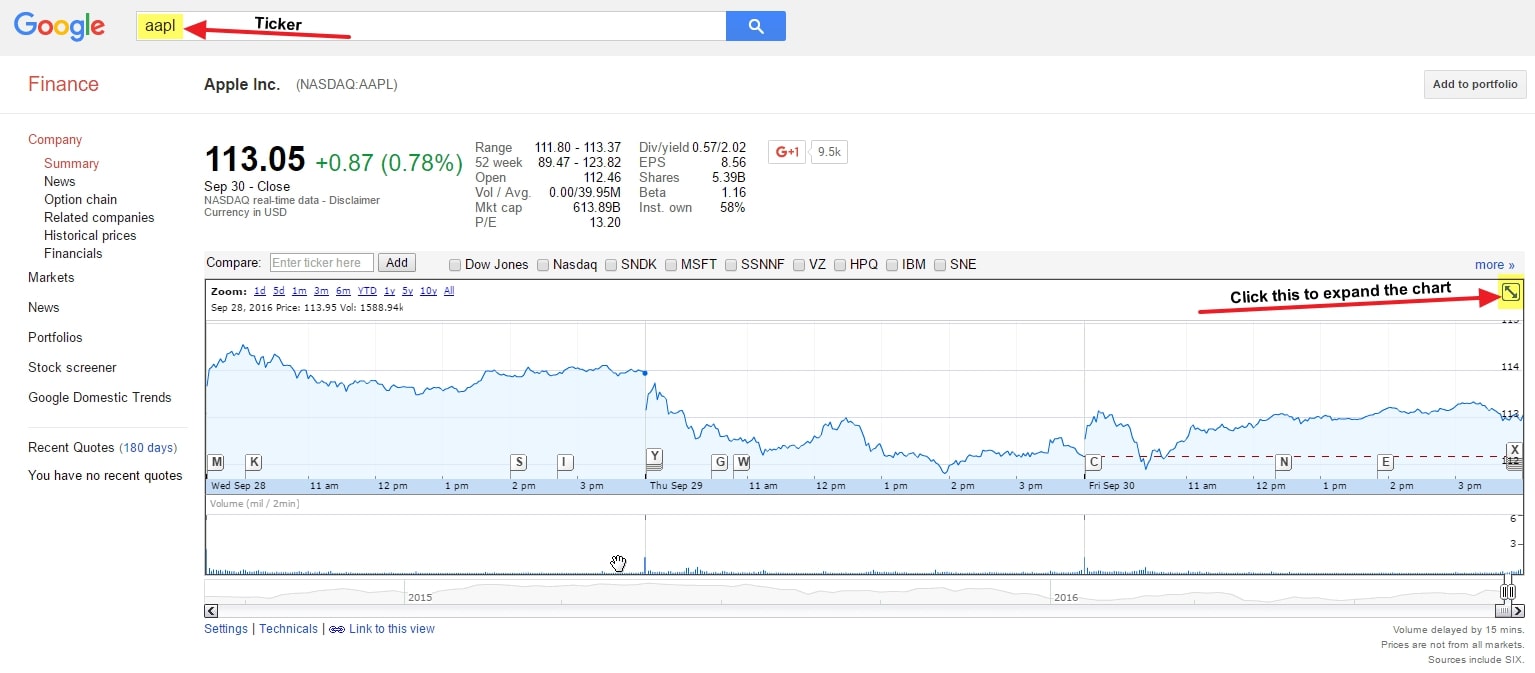
When we click the button to expand the chart to full screen .
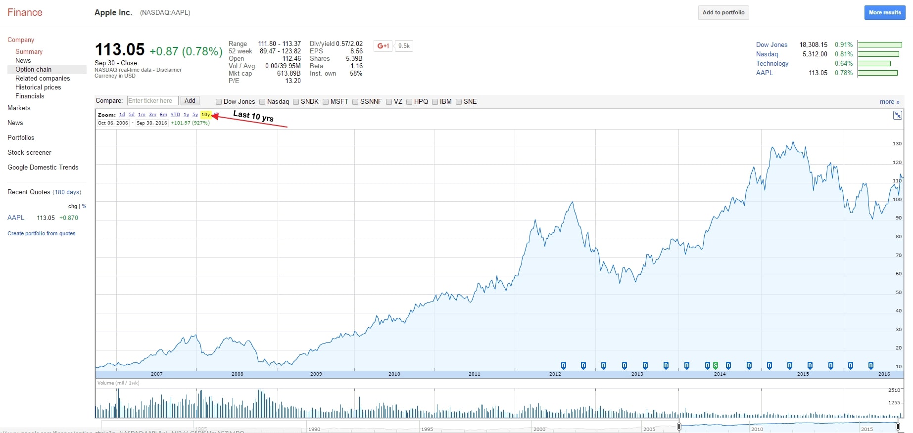
We have taken the liberty to filter just to the past decade, which you may easily do simply by tapping the corresponding button. The latter has been highlighted for you.
Here we are looking at Apple stock over the last decade. Wouldn’t it have been great to have this in winter 2008?
Now we may proceed with analysing the stock chart to pieces so that you may learn to read it like a pro!
You may easily buy stock on your own with PrimeFin
The PrimeFin app facilitates trading for investors by analysing stocks thru the use of quick-to-open charts. You may swiftly filter the chart from Day One right down to five years’ performance worth . You only have to tap your finger anywhere on the chart and get historical pricing. Kind of neat, actually.
Also, PrimeFin has a commendable, quality news stream. Similar to a Facebook stream, just focussing on stock news and just right for staying up to date on market trends.
Trades with PrimeFin cost $0 – look no further if you are looking to invest on your own!
When learning how to read a stock chart, how do you analyze a stock chart?
Now that you have a better idea of what a stock chart is, we come to the point of actually reading one. In its purest form, a stock chart is precisely what we pointed out above – a chart with a given stock’s historic prices.
But where it assumes even more significance is when you know how to read that information and interpret what it’s showing to make more precise predictions regarding how the stock will perform in the future.
Below, we will be discussing four vital data points you need to understand to fully leverage a stock chart’s power.
Identifying the trend line: how do you read a stock?
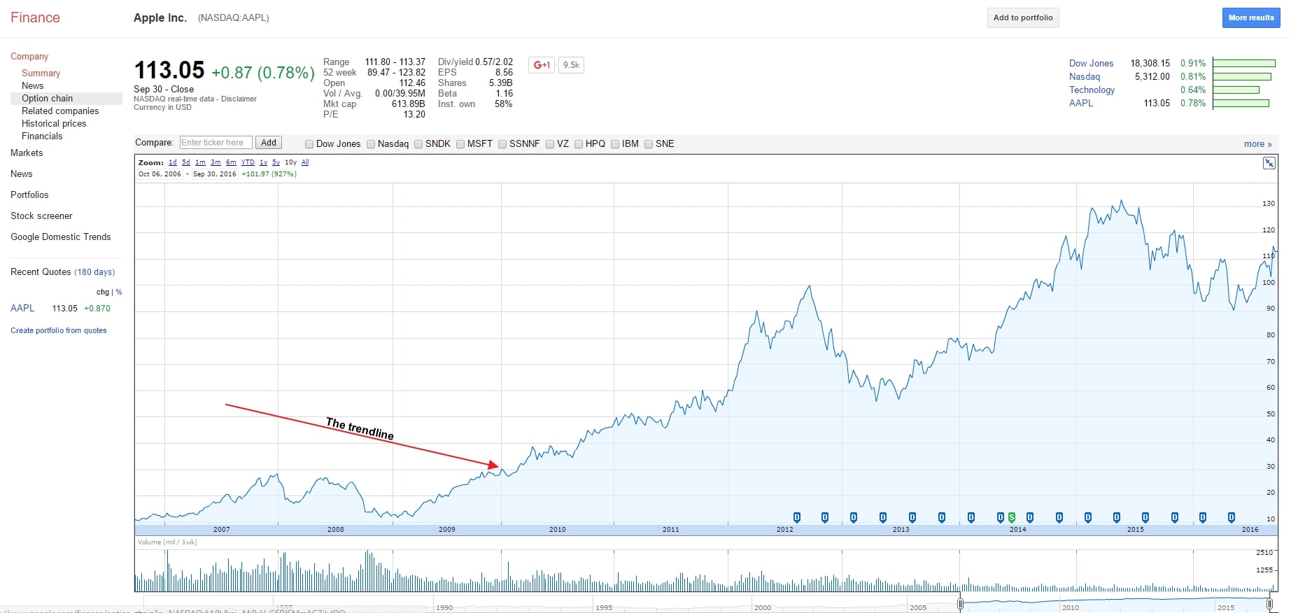
We have pointed out the blue Line that you see every time you hear about a stock – it’s whether rocketing or plummeting, right? So on the face of it the trend line appeared to be common sense. However, there are a number of things we’d like to underline so that there’s more clarity.
First, understand that stocks will take huge dives and also make massive climbs. Avoid reacting to huge drops and glaring gains either positively or negatively. This part of the stock chart just keeps you in the loop of things.
Truth to tell, the trend line ought to lead you to do further. For example, Apple as a firm shot off between 2009 and 2012.
But what took place in 2012- 2013? The stock began plummeting at one time, shares were plunging down more than 40%.
This is where the trend line justifies its existence. News comes and goes. However, it coincides with a spectacular shift in the trend line, attracting attention.
In case you saw something like this happen, we’d urge you to look further into the company. But, unfortunately, even amongst the strongest, a few companies have their ships scuttled, torpedoed like this.
For those that do not know about this time, Apple went thru a few conspicuous shifts: first, long-time CEO Steve Jobs resigned in 2011. Also, around 2012, Apple observed that their profit margins were shrinking conspicuously, notwithstanding a growing smartphone market. In the end, they were attempting to expand the smartphone into developing countries.
These factors, combined with plenty of variables , contributed to the stock price plunging.
However, new CEO Tim Cook made some strategic moves with the company to revitalise it, exemplified by the trend line.
The lesson is to use the trend line as a high-level indicator that tells-all at a glance.
Look for support and resistance lines
The next thing you have to take note of are support and resistance lines.
There are levels wherein the stock remains over a duration of time. A support level is a price that a stock is not likely to plunge below. On the other hand, a resistance level is one that it will not, in all likelihood, go above.
Only a reduced profit margin can bring that about.
These lines are akin to bowling alley bumpers. When you are bowling, the ball bonus back and forth between inflated barriers.
The price of a stock does the same within lines of support and resistance.
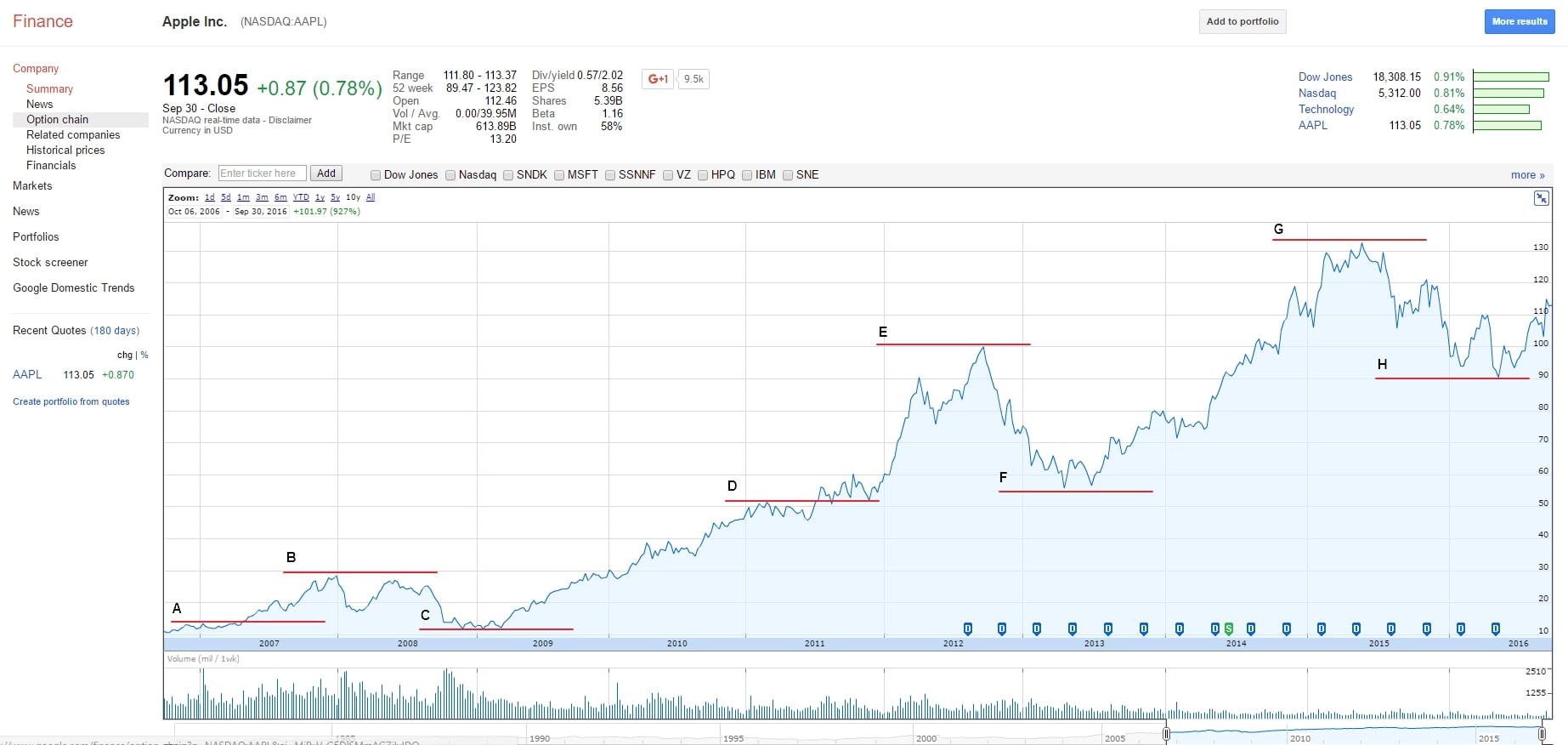
The objective here is to know when to buy/sell. So we will take a gander at the Apple stock chart again, seeking out an example:
Notwithstanding subjective interpretations, the process remains important. Depending on their investment horizon, the loans of support and resistance will be drawn variously by different investors.
If you are planning to hold your stock for some time, you may not draw as many support and resistance lines since you do not care about appreciation/depreciation. On the other hand, if you are a short-term investor, you may draw more to analyse trends during a shorter period.
- Let us break down the graph with every trend line:
- Line A is the very first Line of support shown. Contingent upon trends before this, you may rest assured that the stock price will not go below this point;
- Line B is our first Line of resistance. The stock has peaked at that pon for the time being. You cannot expect it to climb high either;
- in Line C, the stock has bottomed out again, thus creating a new line of support;
- Line D has the stock price climbing significantly, and we can safely establish this as the new Line of support;
- You may see the trend continuing with Lines E, F, G, and H. With time, new support and resistance lines are brought up.
When you know the lines of resistance, you can decide when to buy/sell. However, this is all subjective. Therefore, this is no guide map for what should be your next move.
All the more reason you should devote more time to honing your analytical skills.
Know when dividend and stock splits take place
At the chart’s bottom, you will find if and when a dividend was issued, besides if there was ever a stock split.
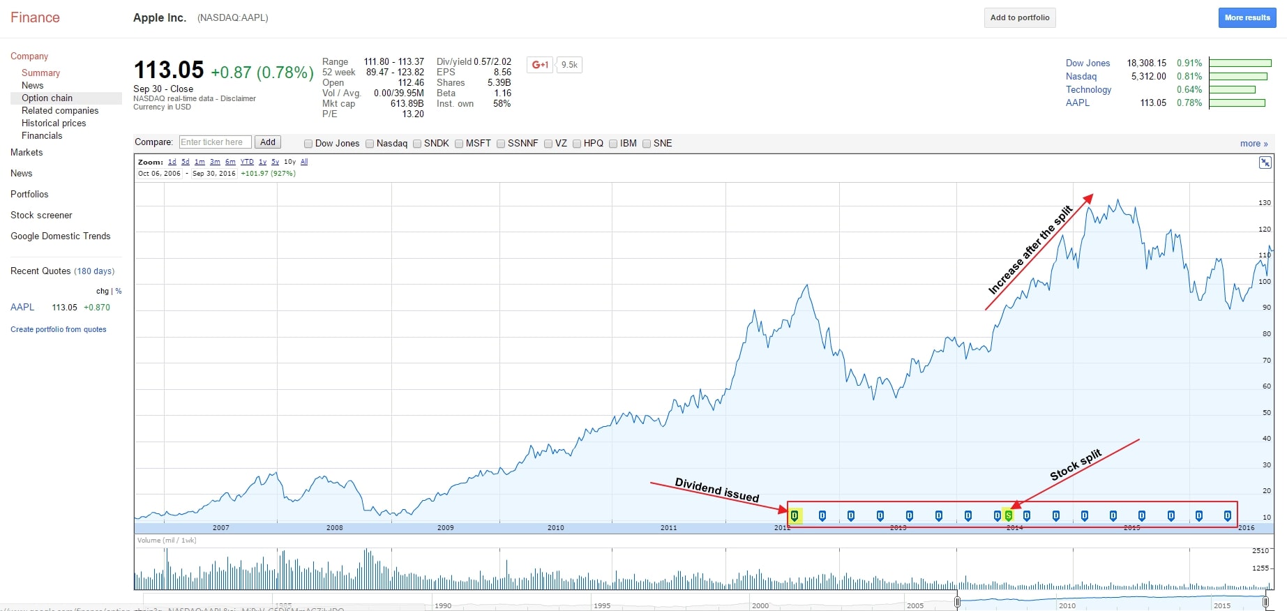
A dividend occurs when the company decides to give shareholders a portion of its earnings. So you get a chunk of the profit if you own the stock.
There are companies that do not offer dividends. They might be more focussed on growth. They reinvest their earnings. Apple and suchlike can not only issue dividends but also focus on growth.
Per the graph, Apl started issuing quarterly dividends to shareholders midway thru 2012.
Apple did a seven to one stock split. So you would now have seven for every AAPL share you owned before the split.
You can make out the uptick in the trend Line following the split. This is because frequently when a stock slit takes place, more people invest, amplifying the demand. Generally, the stock price appreciation takes place under such circumstances, too.
Understanding historic trading volumes
At the chart bottom, there are no a few small, vertical lines.
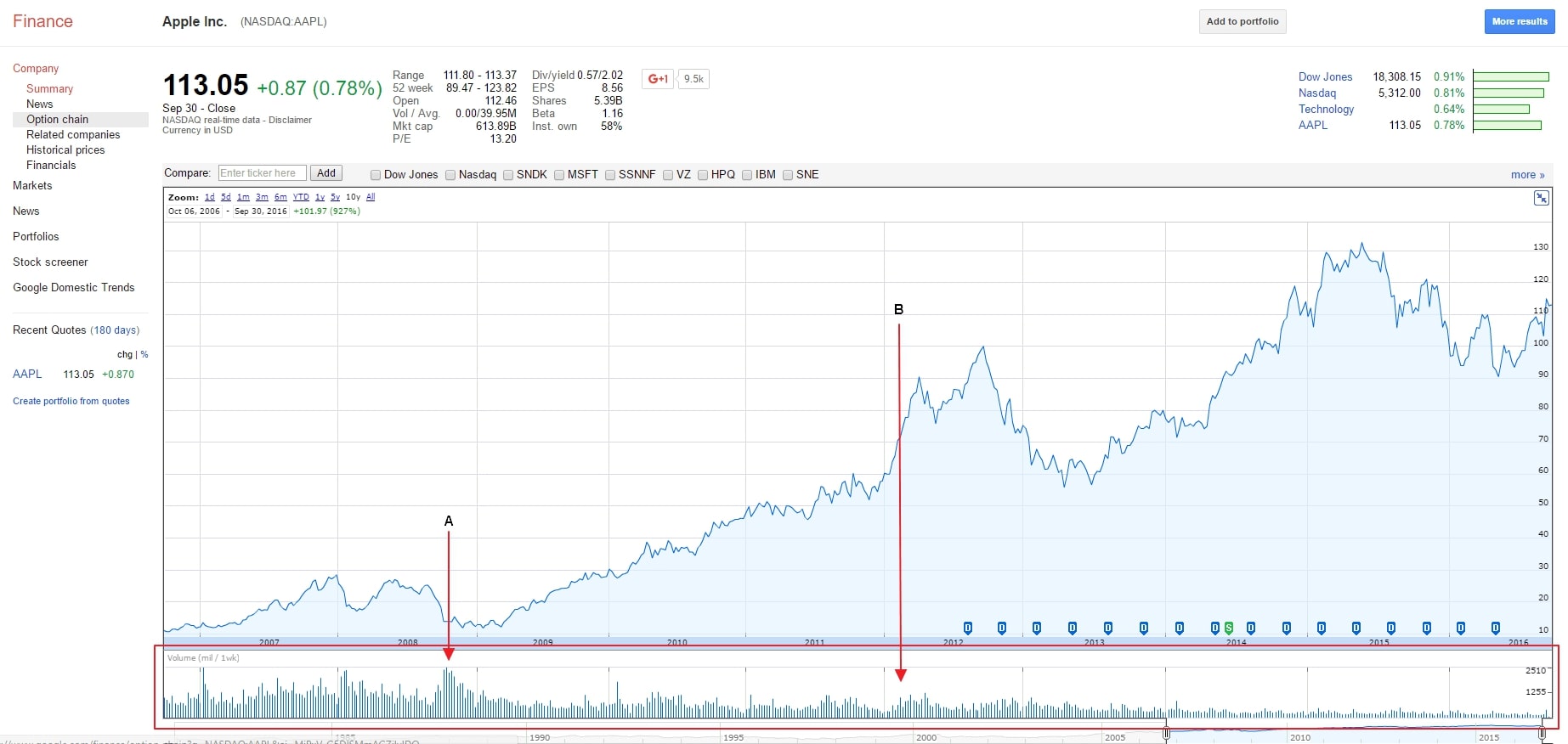
Volumes are not the only determinant of a stock’s worth. Volumes increasing can also push up stock prices.
In Line A there’s a high volume of trading activity that corresponds with a plunge in the stock price. Moreover, there’s every likelihood of a news doing the rounds that day that dampened investor enthusiasm.
In Line B, there’s a slight uptick in the trading volume corresponding to a stock price upward trend.
Do not always assume there will be a correlation between stock price and trading volume. However, prior to a decision, it is best to know what the volumes were and what they are at the current moment.
Intuitively, with high volumes comes greater ease when buying/selling. With a crowd of investors backing a stock one day, the latter can be bought/sold in a jiffy.
Your choice destination for stock trading tools
Once you have the basics down pat, you can find a more powerful set of tools.
Investby
Investby is very impactful, a high performer when you wish to take advantage of trading tools. Indeed, these tools are a cut above the rest.
PrimeFin
PrimeFin is a great firm with an excellent platform. Their trading tools are what you need to arrive at informed decisions.
ABinvesting
ABinvesting gives you access to trading tools that guarantee smoother trade execution.
Conclusion
So now you know how to decipher a stock chart. Furthermore, you will be able to analyse a stock’s historic activity at a high level once you have absorbed these techniques.
Do not forget that past performance is not an assurance of future price indications. You just cannot know in advance if a stock will halve or double.
